Knowing how colour impacts children and families is why at Oak Centre we chose colours that would reduce anxiety and stress
The interview room at the Oak Centre is looking great with it’s new coat of Buxton Blue paint. The room had originally been painted grey but with a desire to brighten the room a repainting of blue was chosen and we think you’ll agree it is looking amazing.
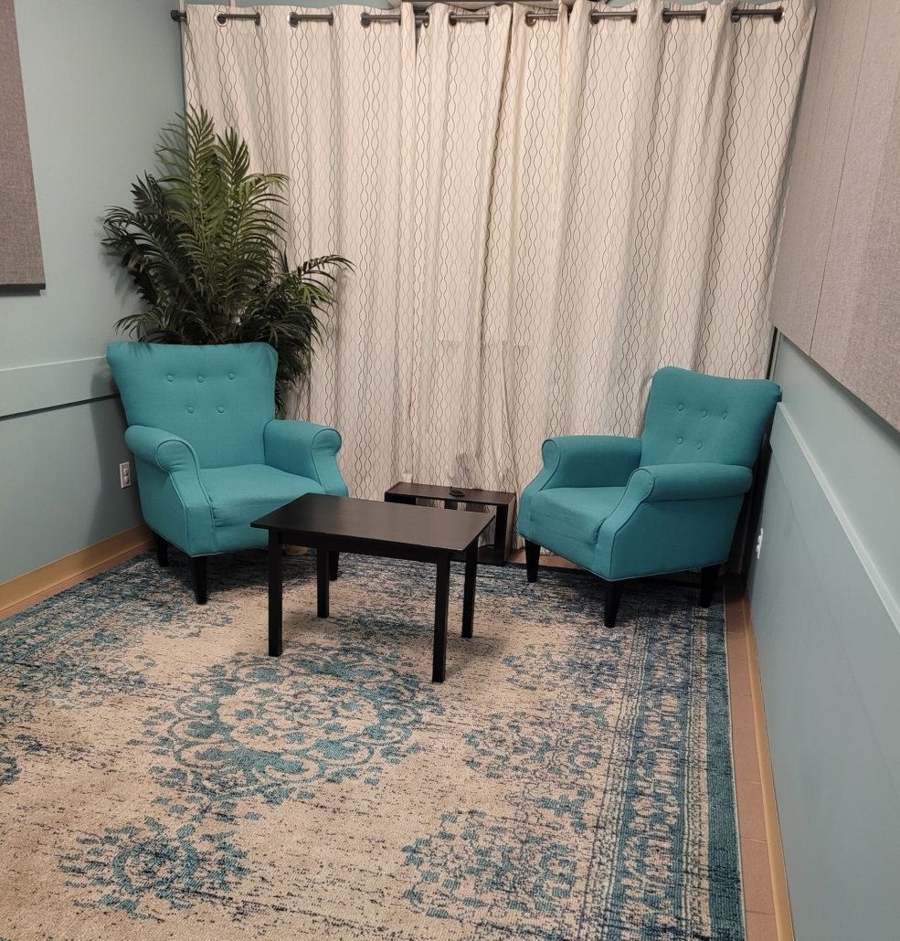
From the onset, decisions on colour and design at Oak Child and Youth Advocacy Centre were thoughtful and intentional in order to create a comfortable environment that would give children and families the best possible space to go through the interview process and get ongoing support. Choosing the right colours and lighting was an important part of preparing it to be a calm and comforting environment.
It is very interesting how colour intersects with emotions, even at times affecting us physically. Some colours feel cold, harsh, and may cause anxiety and others boost
energy and create inspired feelings. For example, orange encourages creativity and can bring a joyful feeling, red can activate energy and can cause a spike in blood pressure and anxiety. Knowing how colour impacts children and families is why at Oak Centre we chose colours that would reduce anxiety and stress, and colours that would eliminate external distractions as much as possible. We mainly use blue tones because blue slows the heart rate and is tranquil. Blue provides a peaceful and calming energy and has tremendous stress management qualities. Grey was also chosen as a complimentary colour to blue. Grey is a soothing colour with a cooling presence and it also contributes to the space as a neutral color.
It is a fascinating to thing how something as seemingly minor as paint colour could impact the important work with children and families at Oak Centre.
We also want to add a huge thank you to the volunteers that helped with the project.